ProFormance
A brand, brochure and website for a sports-medicine initiative built on natural healing for the modern athlete.

- Client
- ProFormance
- Industry
- Sports Medicine
- What we forged
- Brand identity · Brochure · Website
Back in the game. Faster.
ProFormance draws on more than 40 years of research into natural healing, with the goal of helping athletes recover without surgery. They needed a brand that felt as precise as the science and as driven as the people it serves.
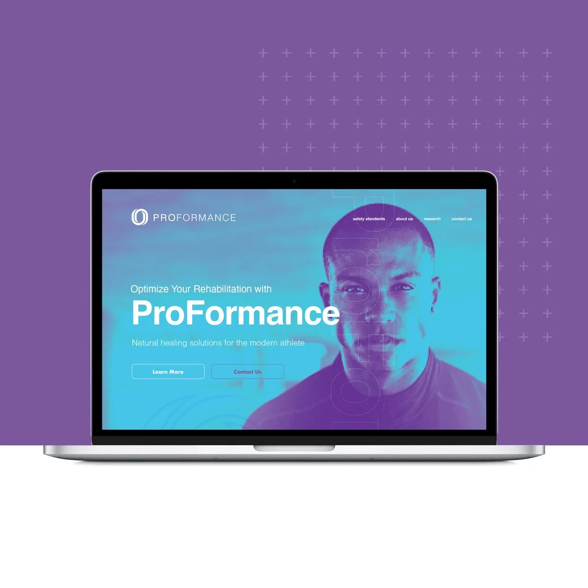
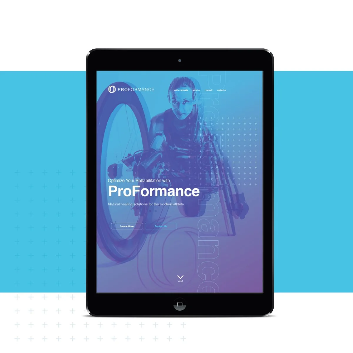
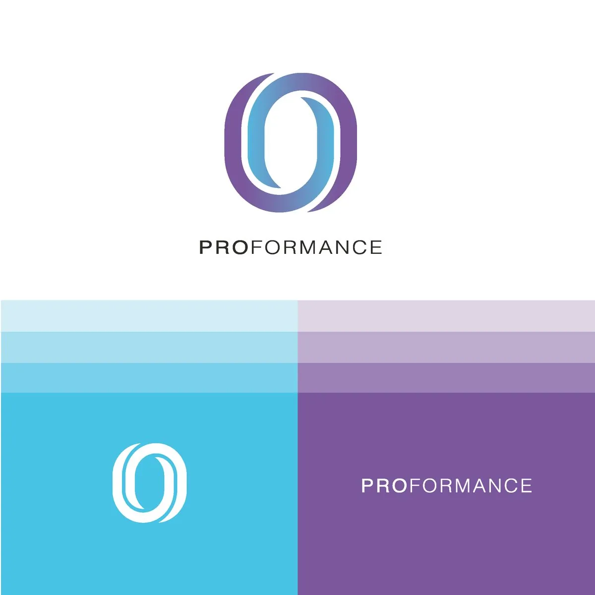
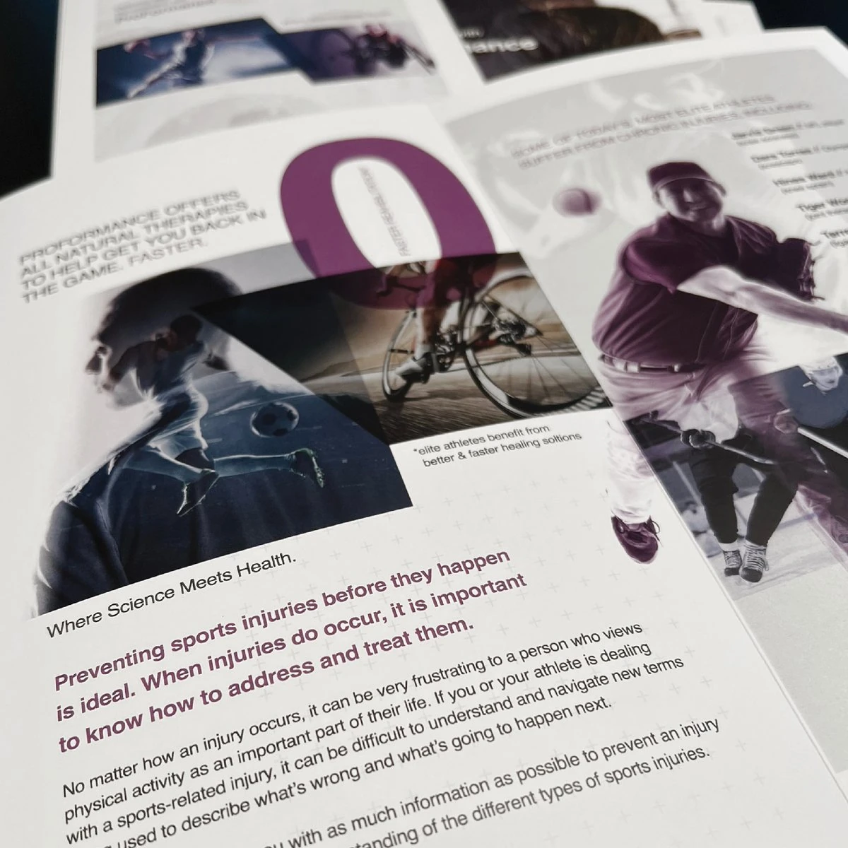
We built an O from two loops that move into each other, a sign of recovery and momentum, in a cyan-to-purple gradient. Duotone athlete photography, angled image cuts and a fine plus-sign grid carry it through the brochure, the website and gear.
The identity
An O in motion
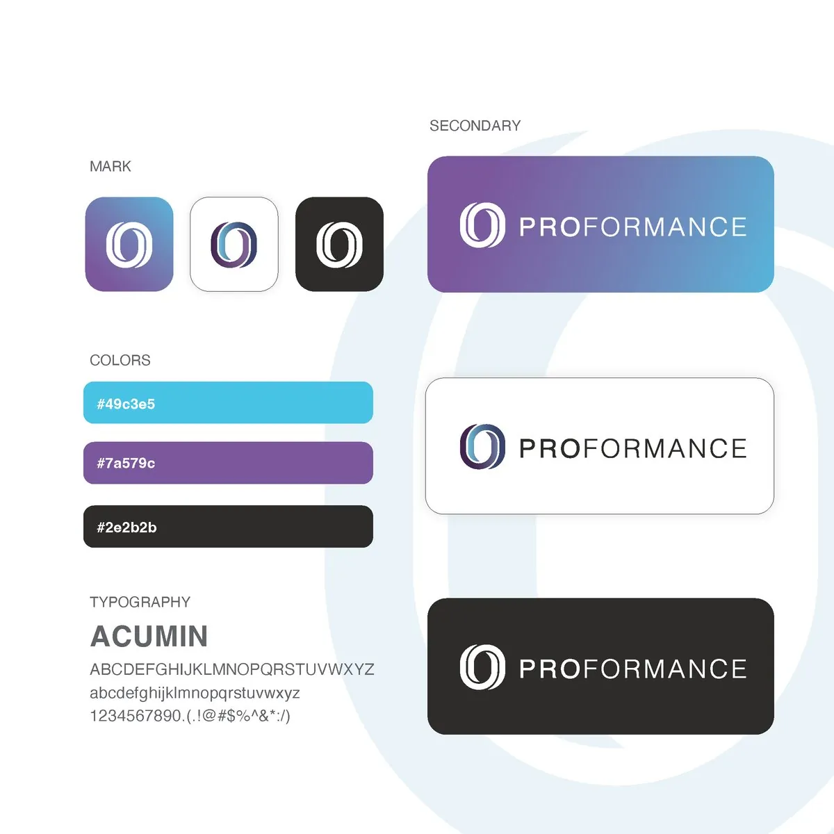
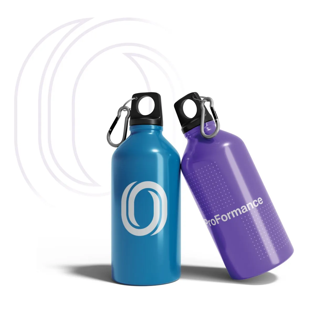
Two loops, two colors, one continuous movement. The mark works in the full gradient, in white on cyan or purple, or in charcoal. Acumin sets the type, and it holds up just as well on a water bottle as on a business card.
The brochure
Where science meets health
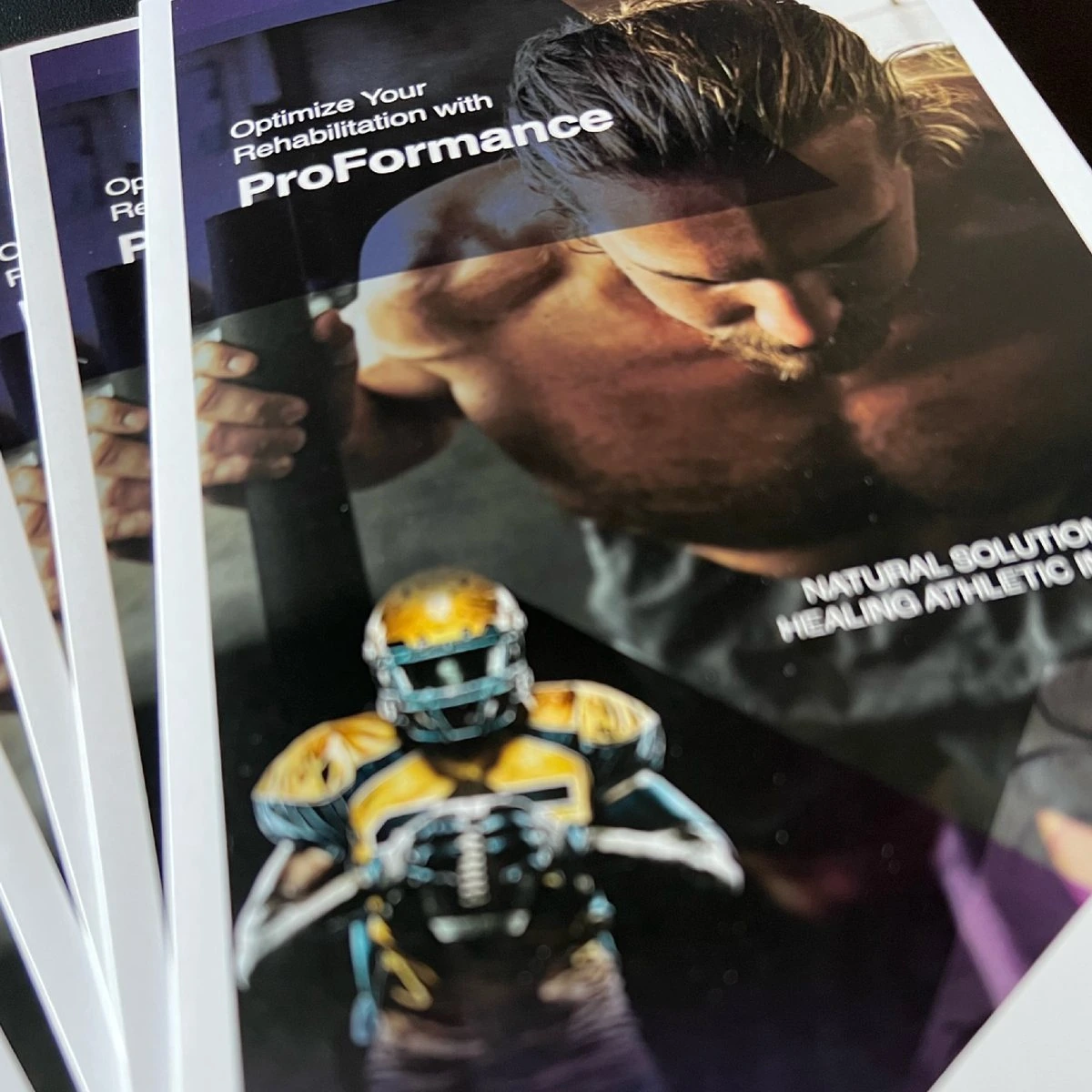
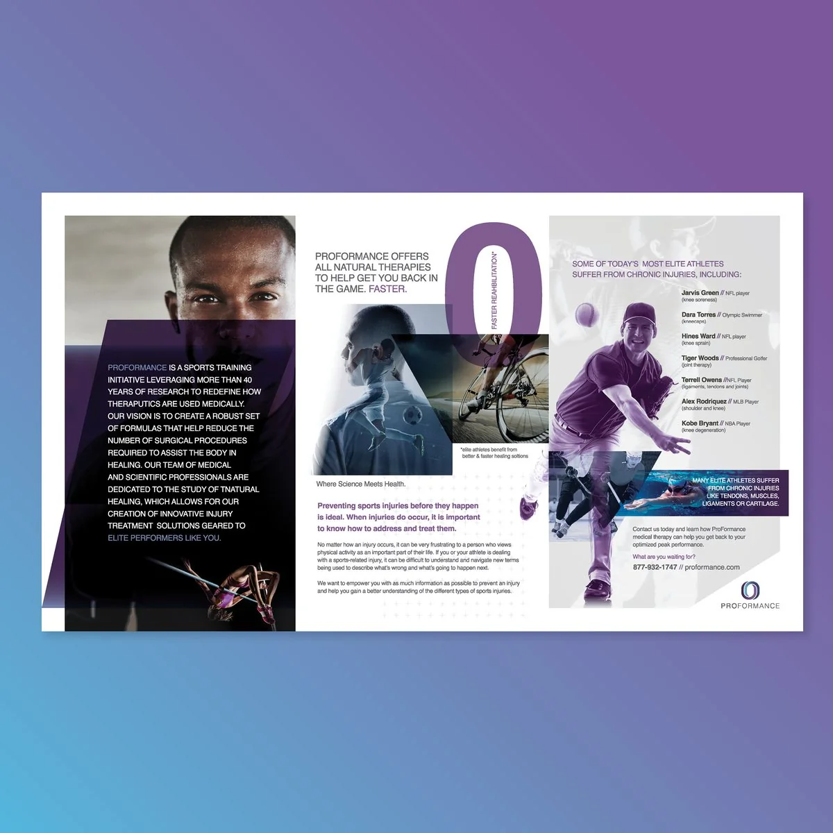
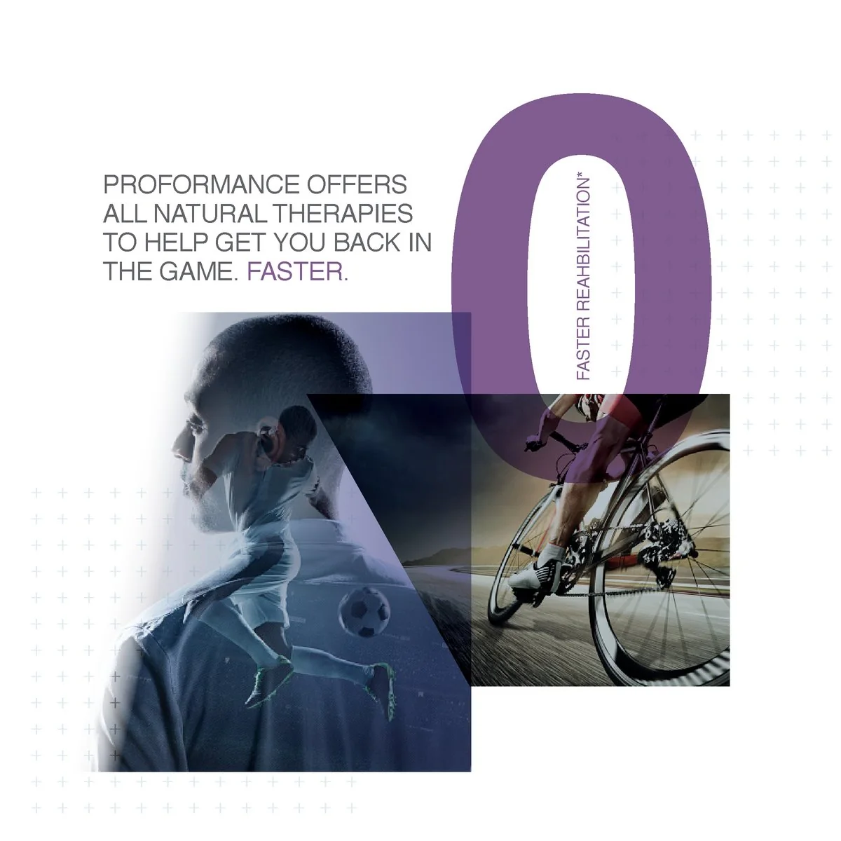
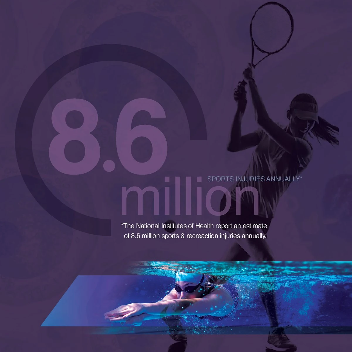
A trifold brochure leads with the problem, 8.6 million sports injuries a year, then answers it with the science. Athletes in motion run through angled cuts and a giant purple O, and every page is set against the plus-sign grid.

The website
Optimize your rehabilitation
The site opens on a full-screen duotone athlete and one clear promise: natural healing solutions for the modern athlete.