HumanRX
CBD made for the person, not the plant — a brand, a product line and a campaign built on one simple truth: you’re only human.
- Client
- HumanRX
- Industry
- Health & Wellness
- What we forged
- Identity · Blend icons · Packaging · Campaign · Social
You’re only human.
The CBD aisle is a blur of pot leaves, hippie fonts and wellness whispers. HumanRX wanted the opposite: something that felt as credible as a pharmacy and as warm as a friend.
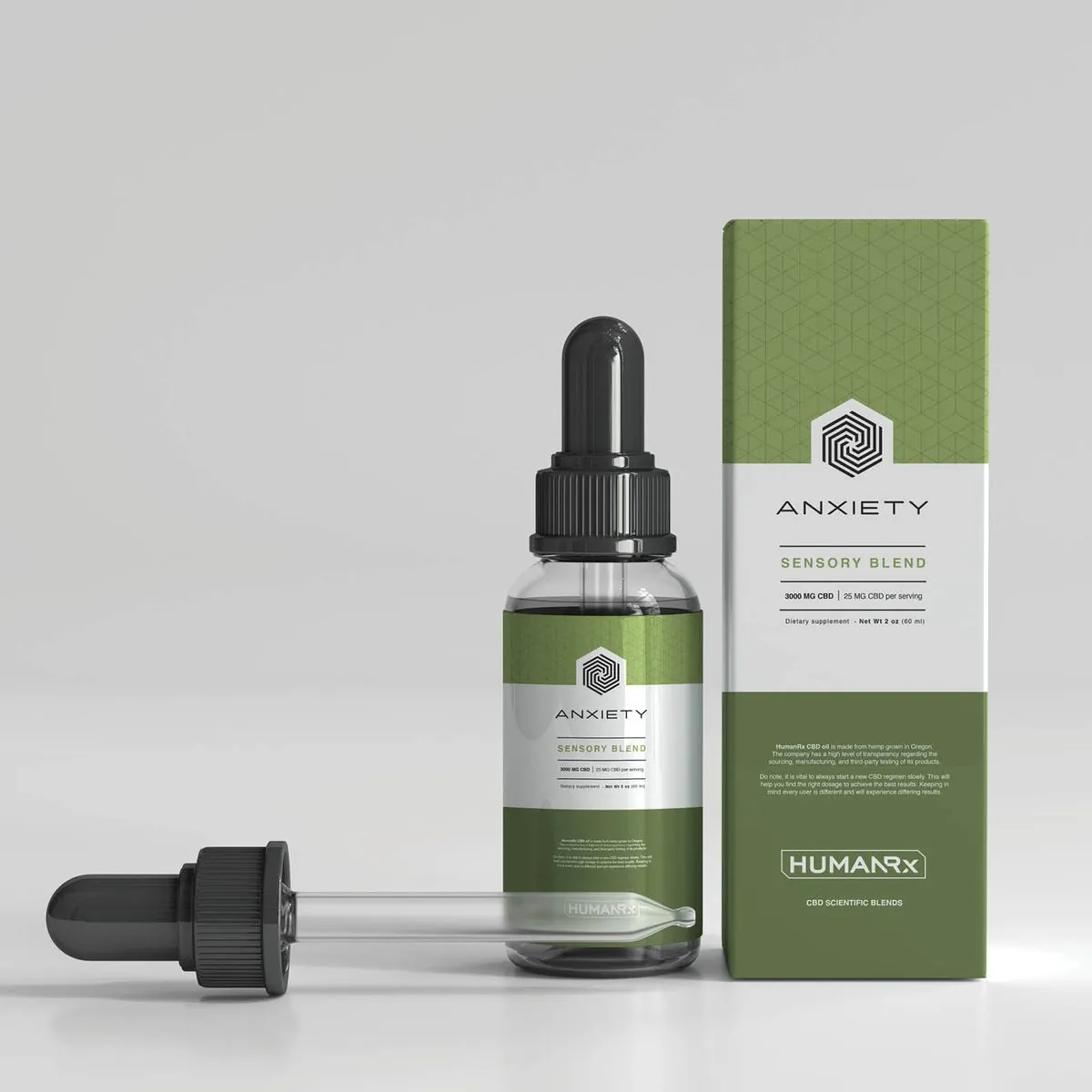
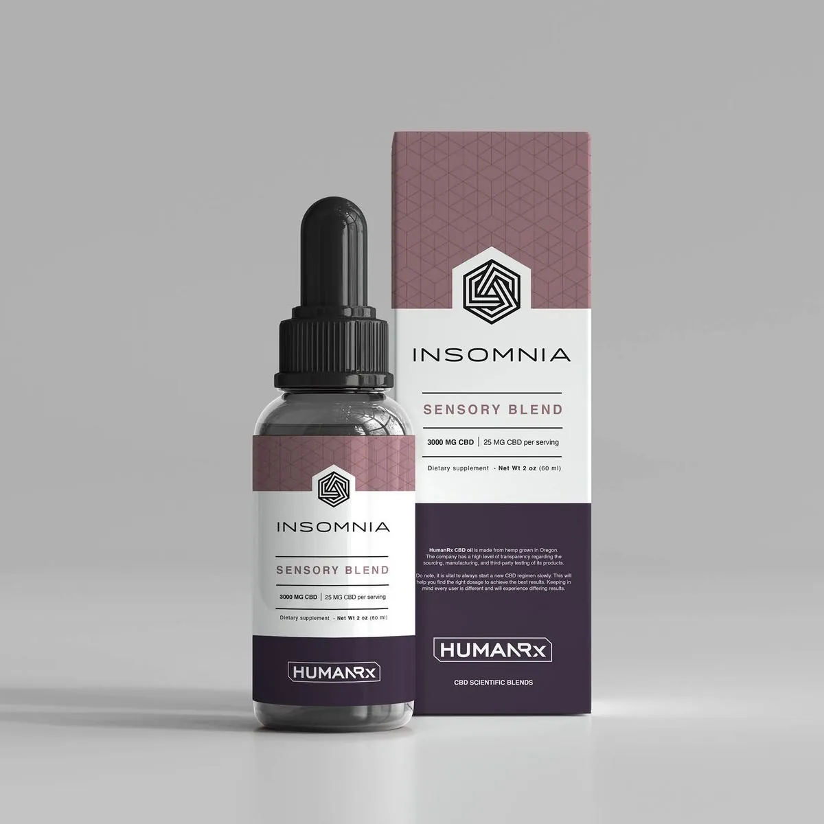
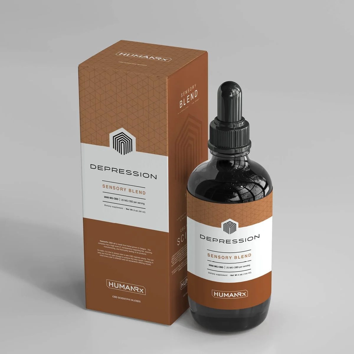
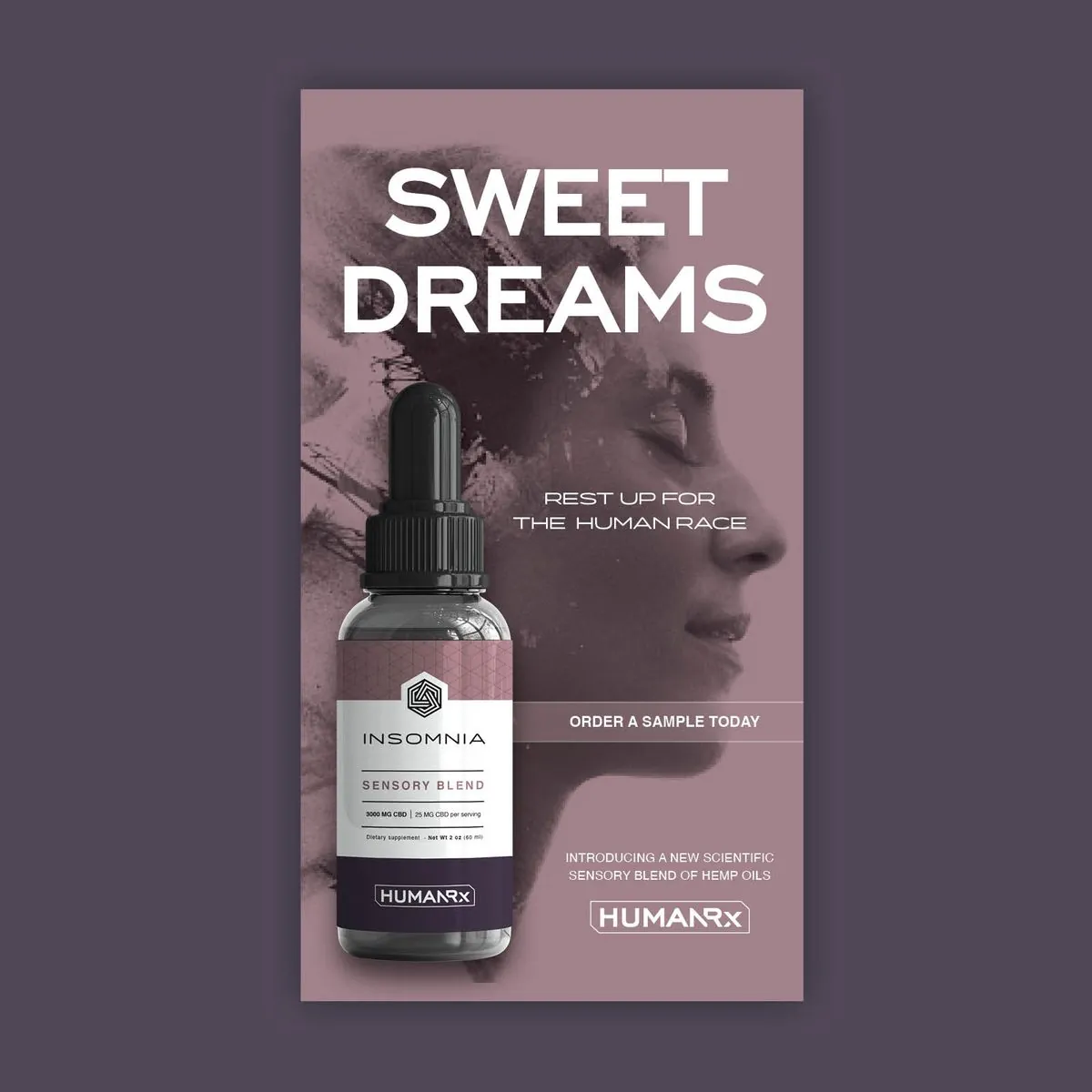
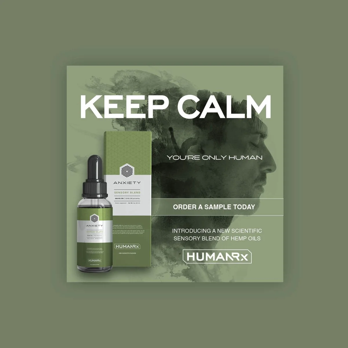
So we stopped talking about the plant and started talking about people. Every product became a “sensory blend” built for one human condition — stress, anxiety, sleep, mood — and every piece of the brand, from the bottle to the billboard, speaks to how you feel, not what’s inside.
The mark
Part lab label, part badge
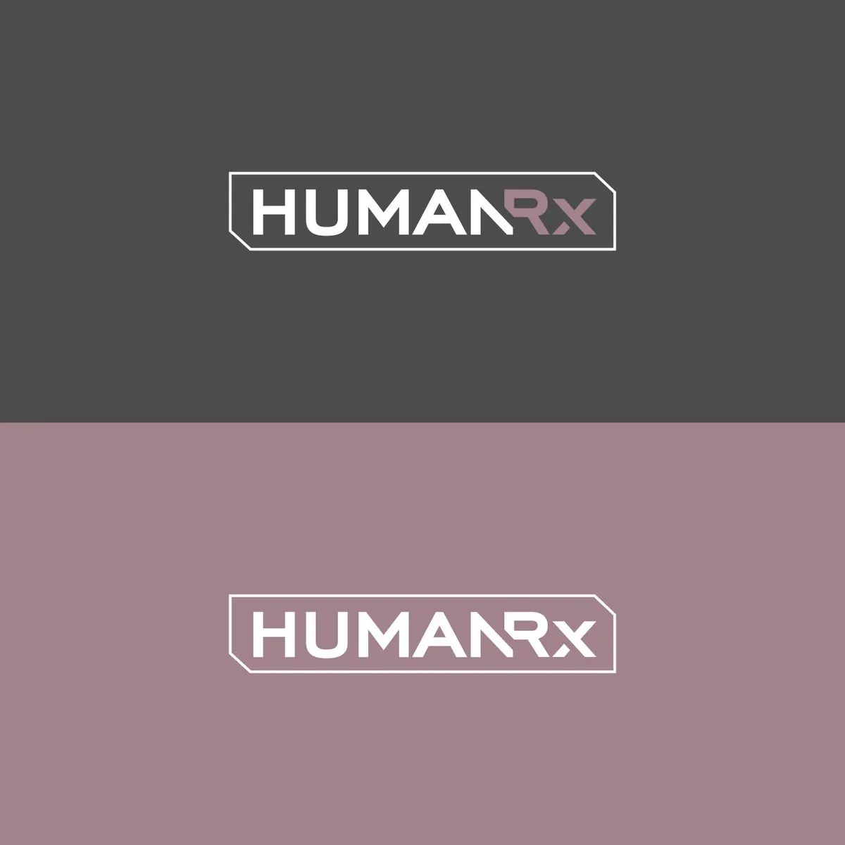
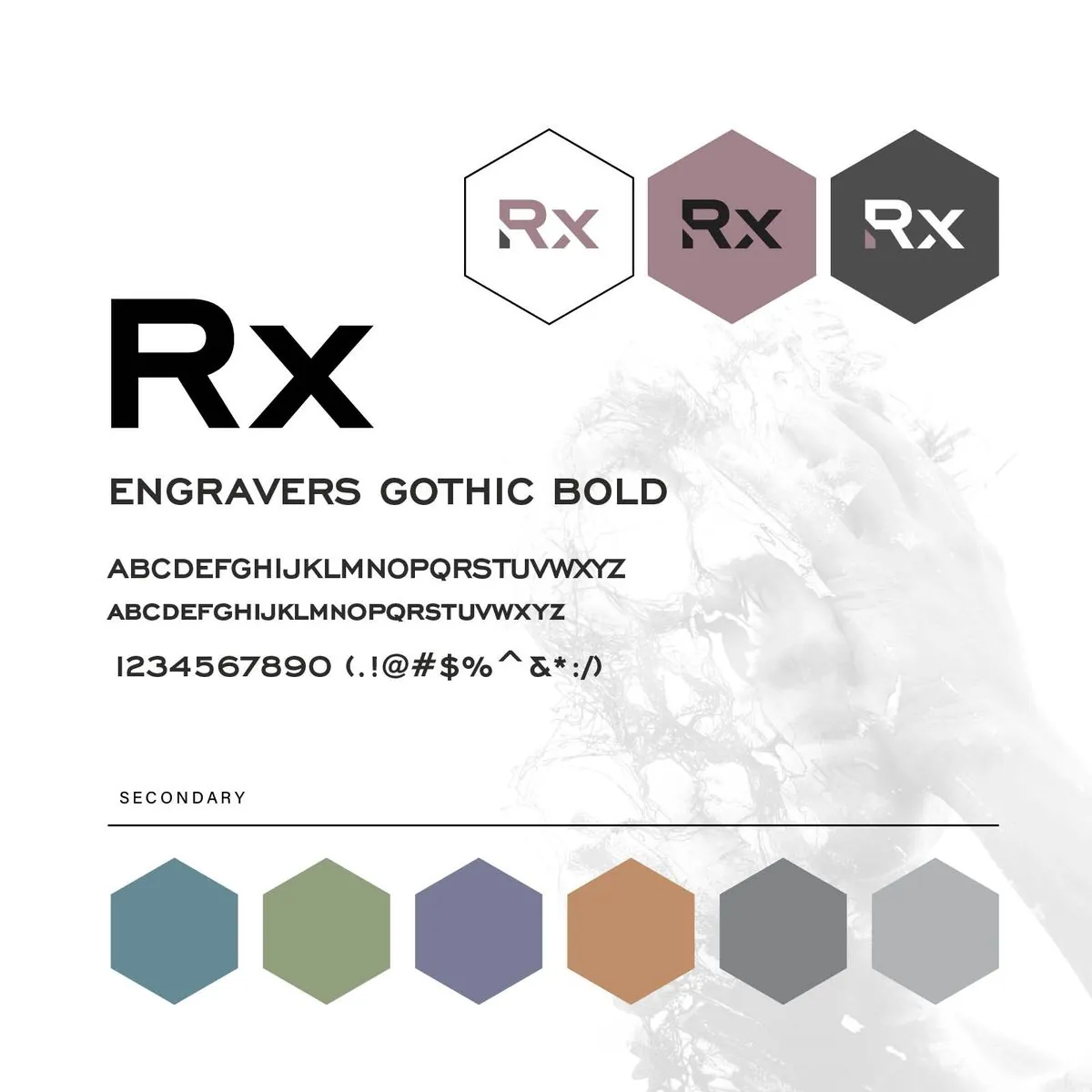
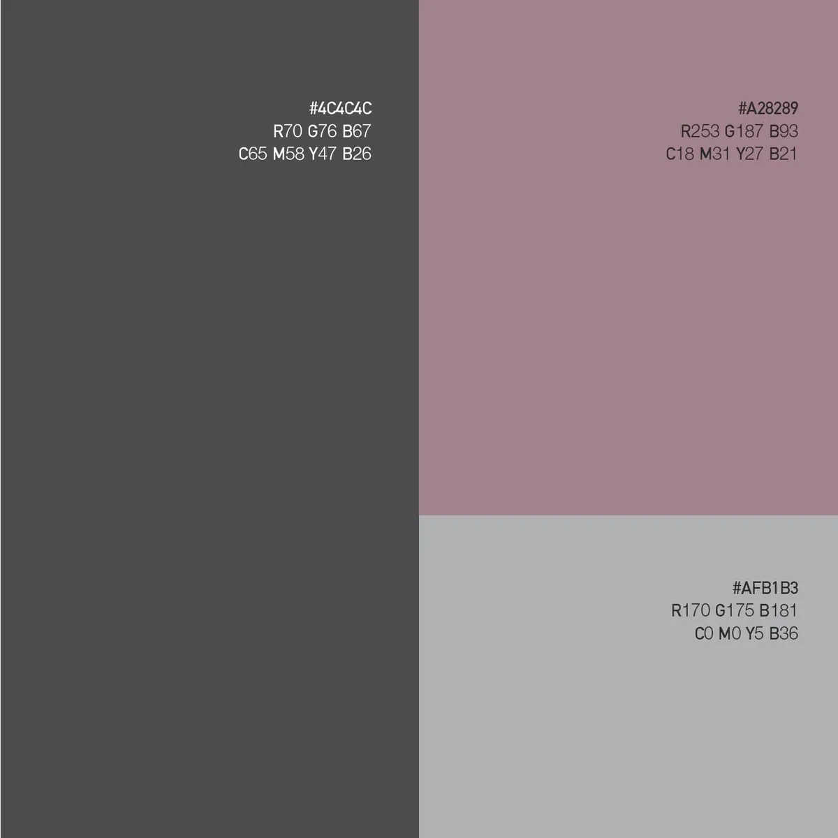
An engineered wordmark set in a chamfered frame, like a sample tag from a lab. The “Rx” is pulled out in soft mauve so the prescription reads at a glance, and it stands on its own as an app icon and social avatar. A restrained palette of graphite, mauve and silver keeps it clinical without going cold.

Sensory blends
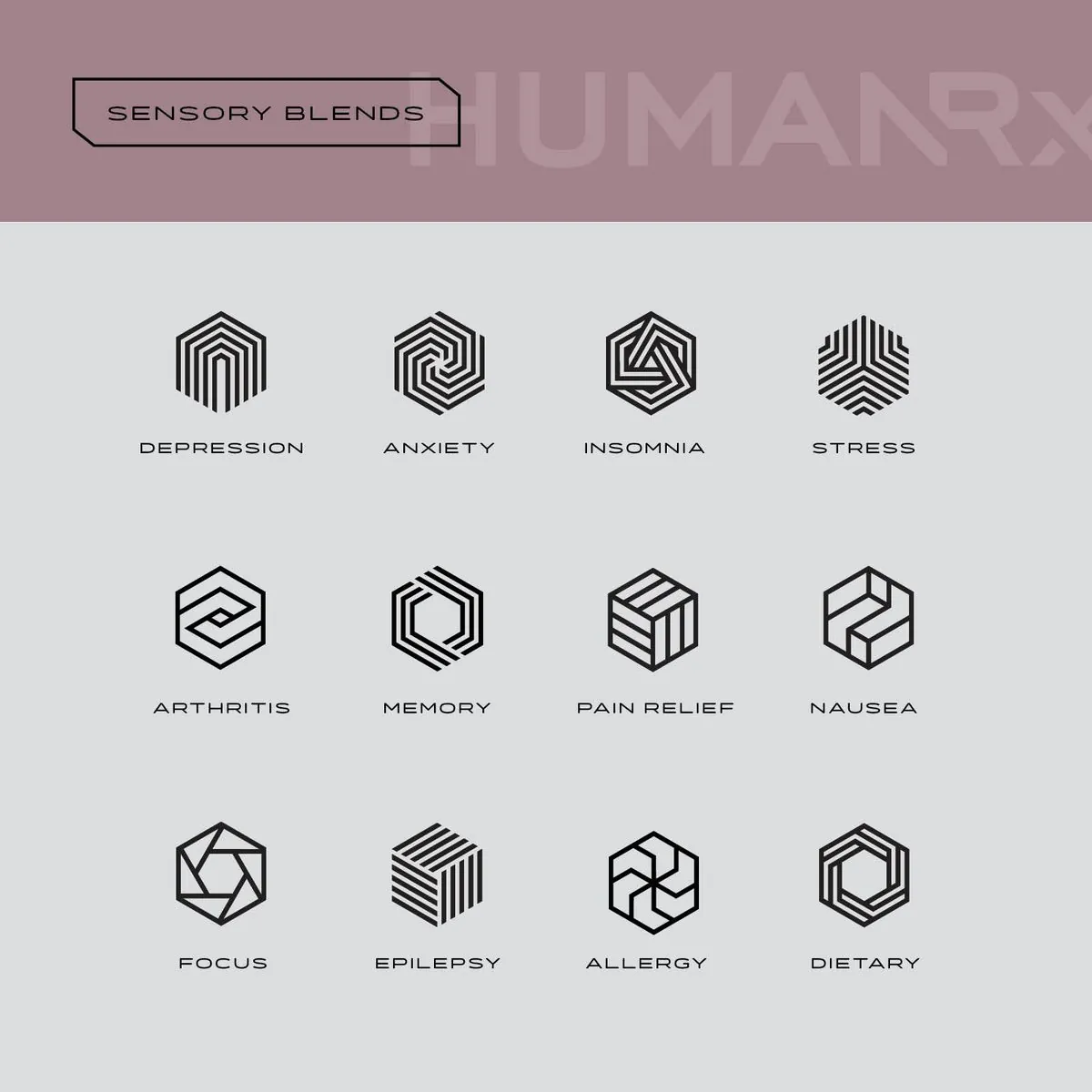
Twelve conditions. Twelve hexagons.
Every blend got its own geometric icon and color, so Anxiety, Insomnia and Depression are unmistakable on the shelf while still living in one family. The hexagon pattern wraps every box and bottle, giving the line the precision of a pharmacy with the polish of a premium skincare brand.
The campaign
Empathy, in large type
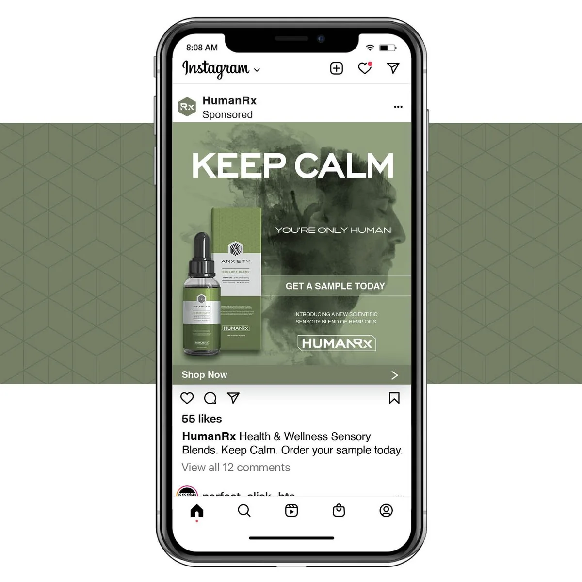
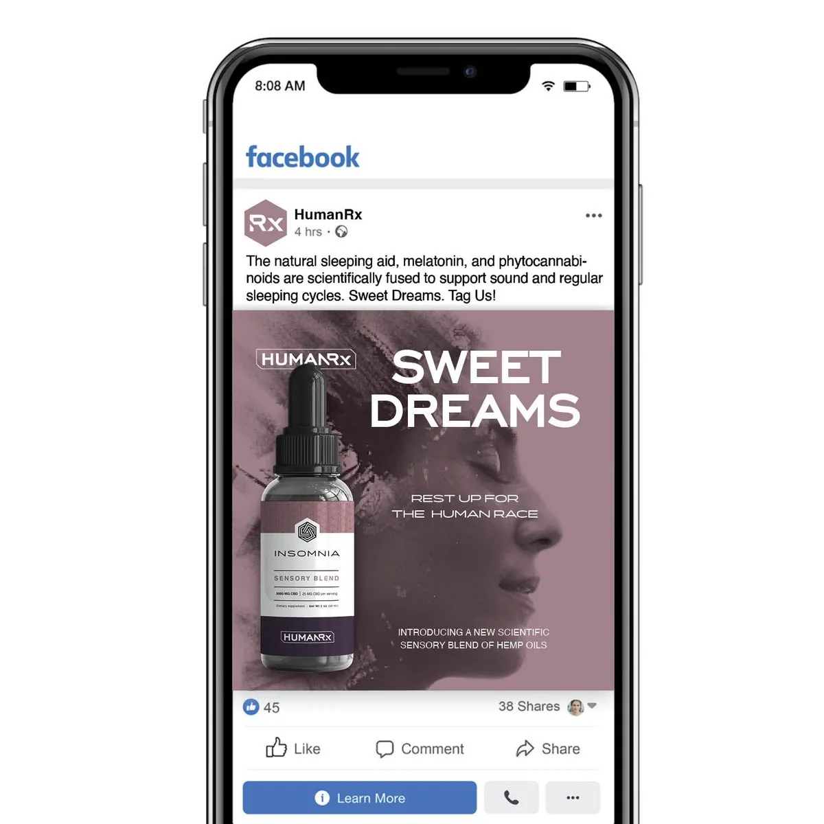
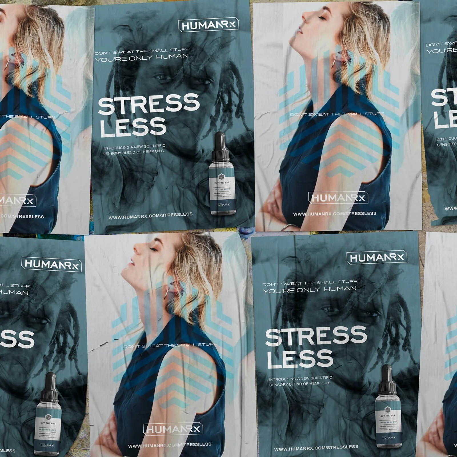
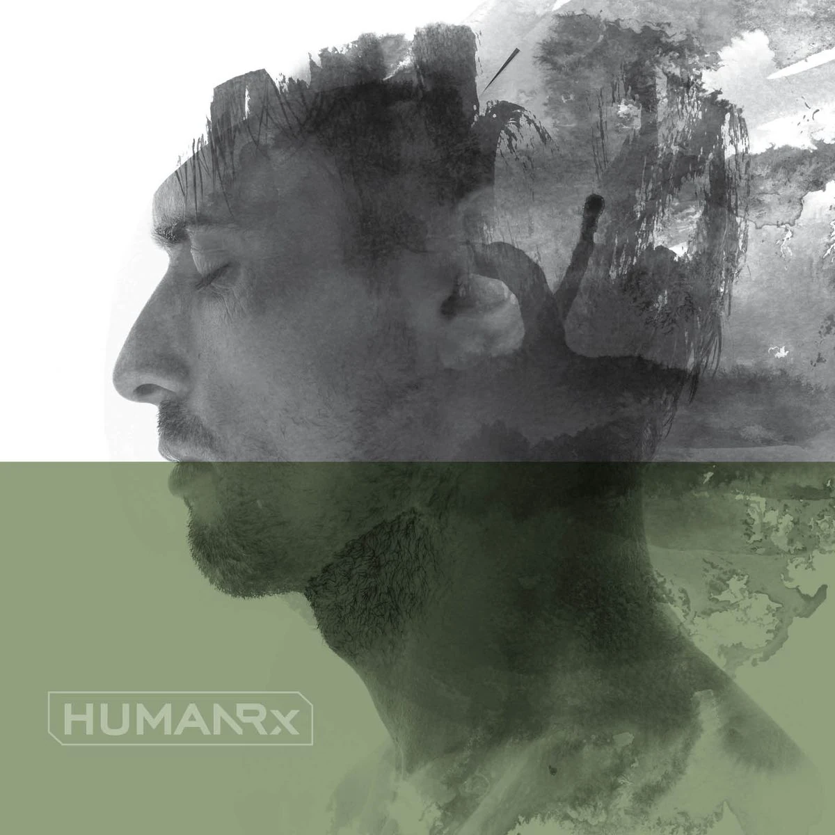
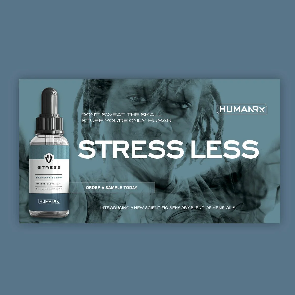
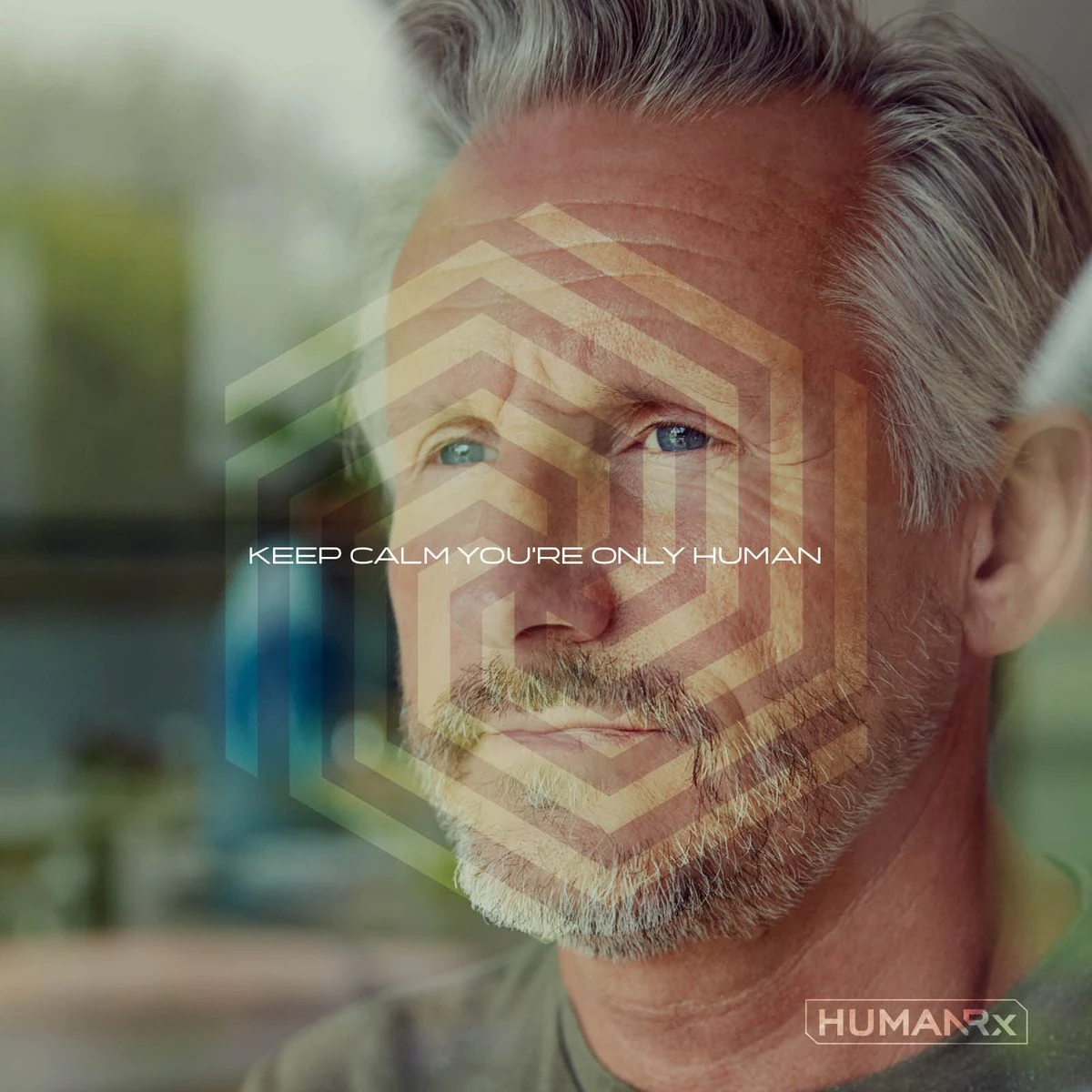
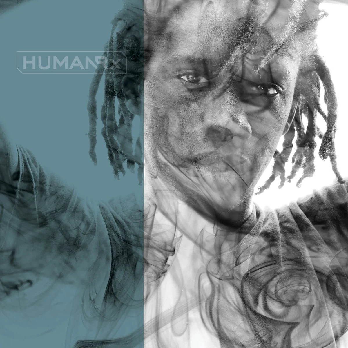
Double-exposure portraits blur the line between a person and a feeling: smoke, ink and watercolor drifting through each face. Every headline answers its condition with a little kindness. Stress Less. Keep Calm. Sweet Dreams. Live Your Best Life. And each ad is tinted to match the blend it sells.

Real humans
The icons step off the bottle
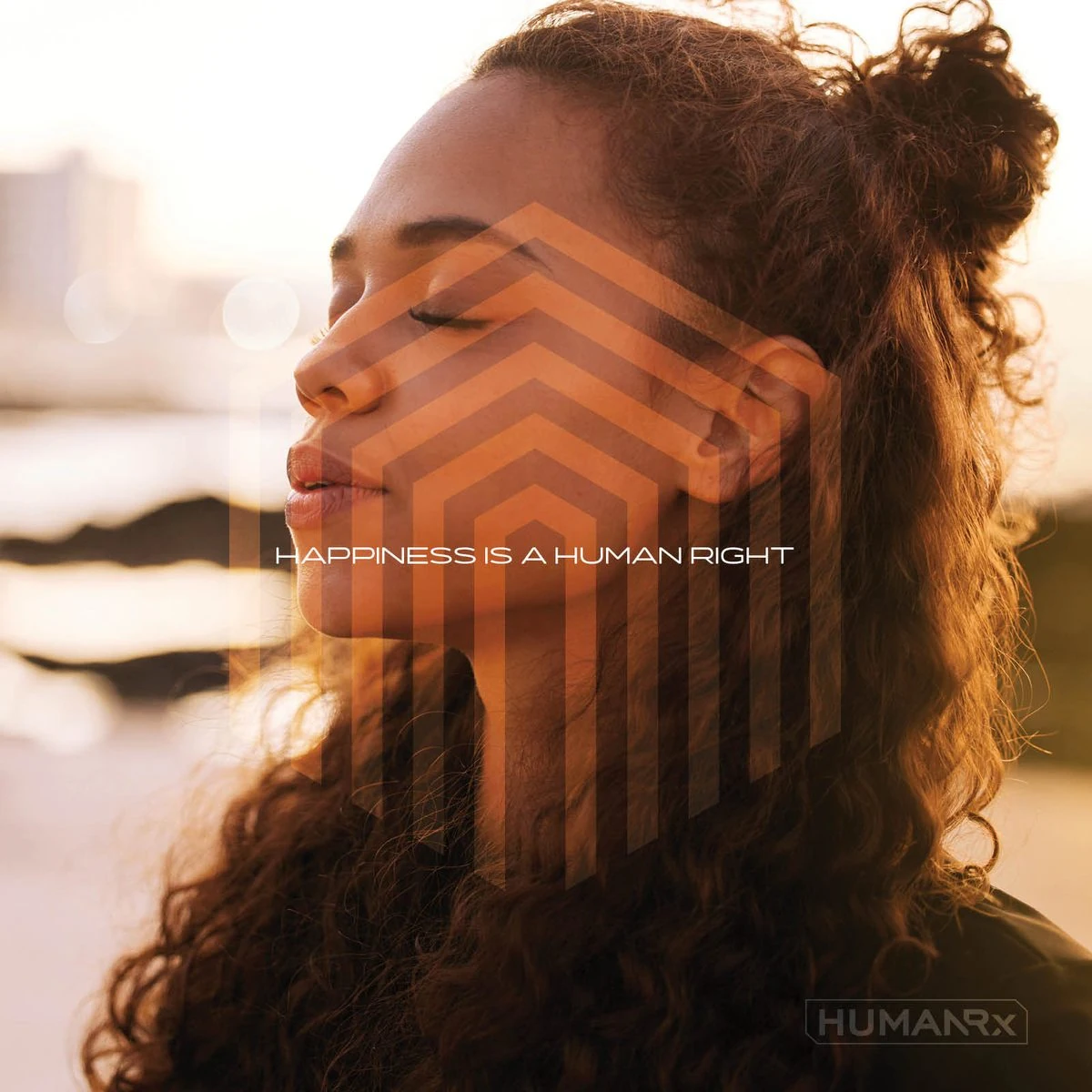
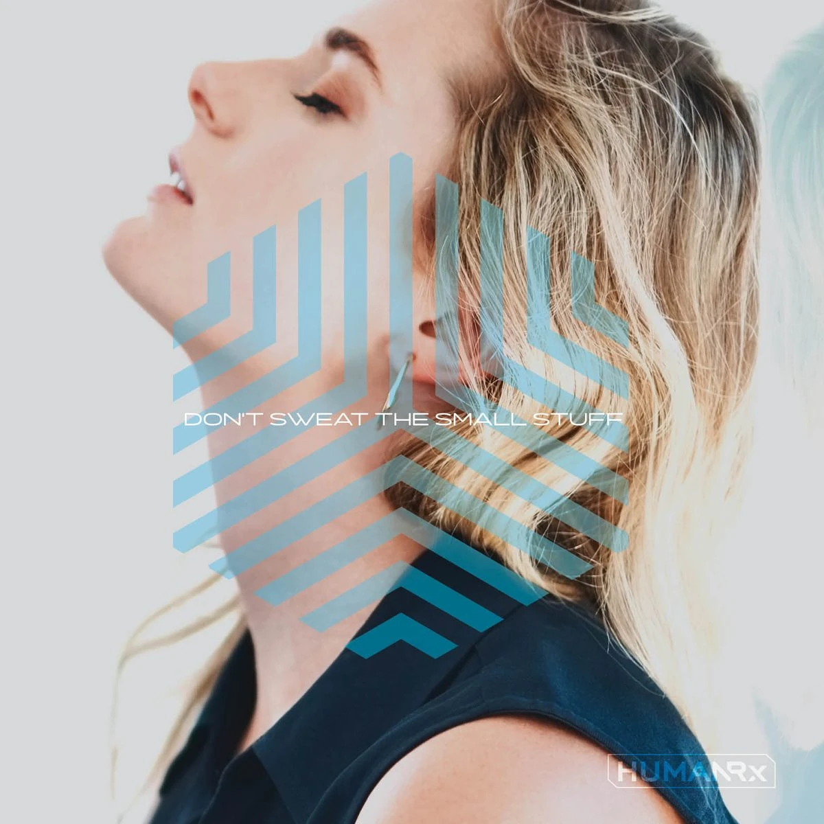
For lifestyle and social, the blend icons are laid over everyday faces in warm natural light, each paired with a line that sounds like encouragement rather than a sales pitch.
In the feed
Built for the scroll
Sponsored posts for Instagram and Facebook carry each blend’s color and voice into the feed, with one clear ask: try a sample.