GREENE Landscaping
A fresh identity, website, fleet graphics and crew apparel for a landscaping company that wanted to look as good as the yards it keeps.
- Client
- GREENE Landscaping
- Industry
- Landscaping
- What we forged
- Brand identity · Website · Print & fleet · Apparel
Go Greene.
When your name is practically a color, the brand had better live up to it. GREENE Landscaping came to us for a look as fresh and well-kept as the yards their crews leave behind.
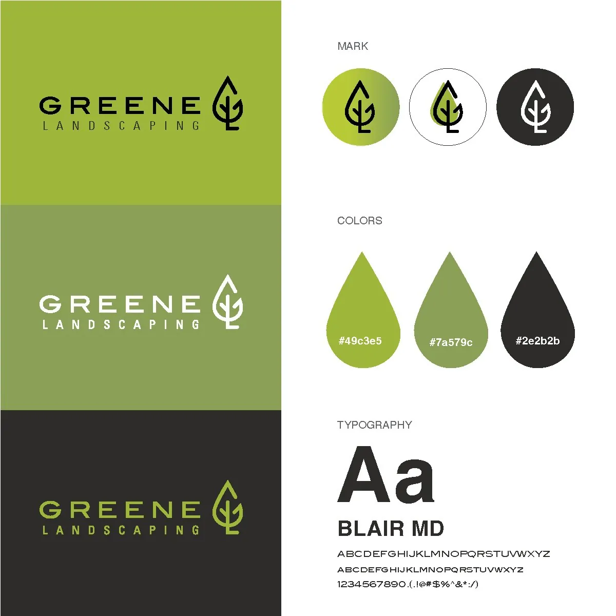
We built it from the ground up: a leaf mark that hides a G and an L, a palette of lawn greens and charcoal, a website, fleet and print graphics, crew apparel, and a campaign that has some fun with the name.
The identity
A leaf with a secret
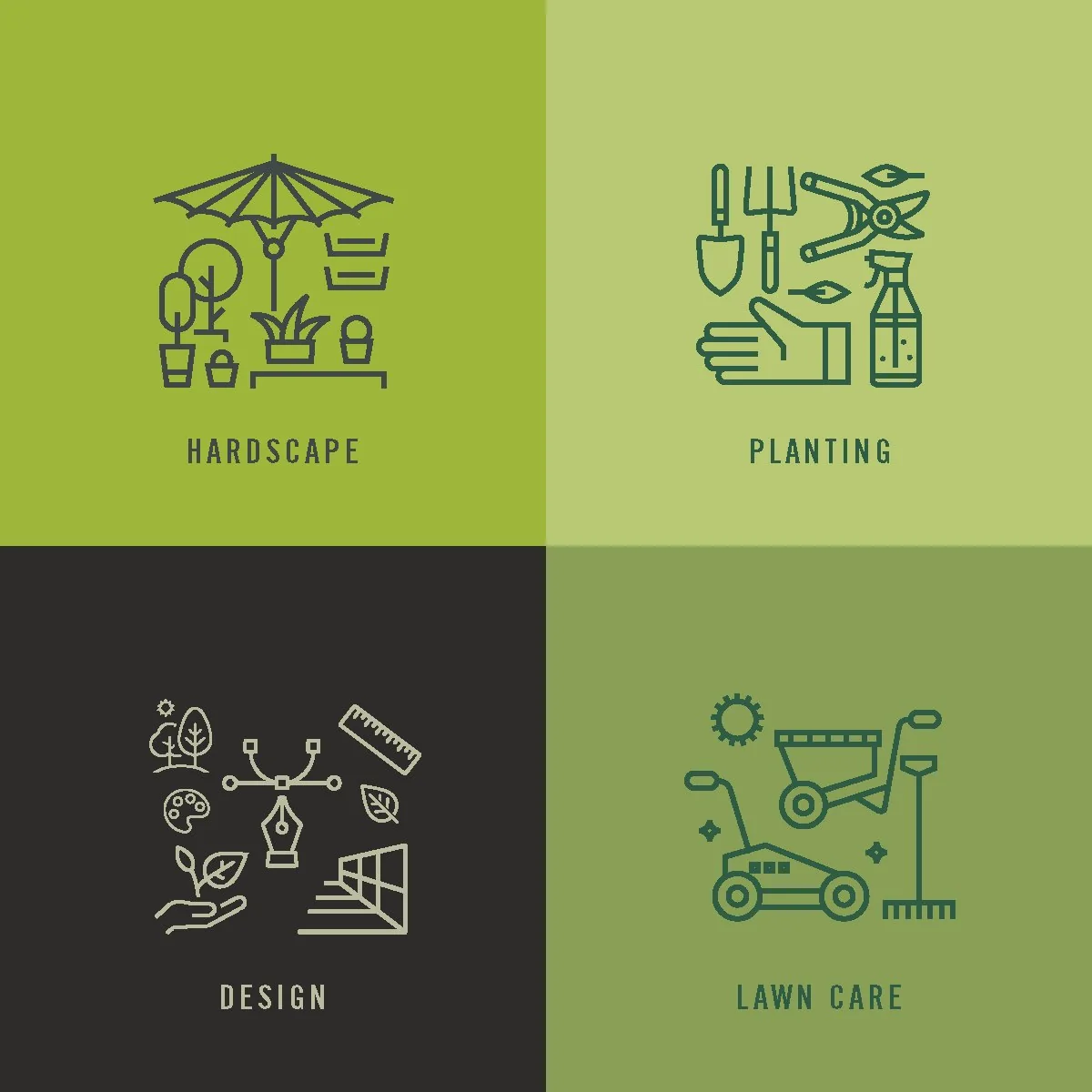
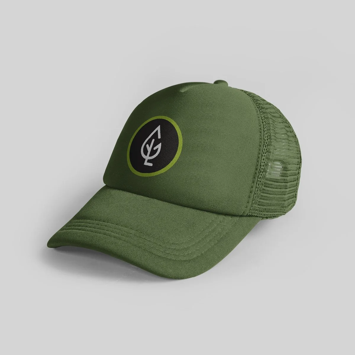
Look closer and the leaf is really a G and an L, drawn in one confident line. A hand-drawn leaf pattern, three lawn-and-charcoal colors and a set of line icons for every service make up the rest of the toolkit.
Out in the field
Branded from the truck to the clipboard
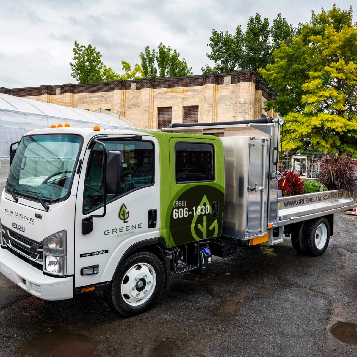
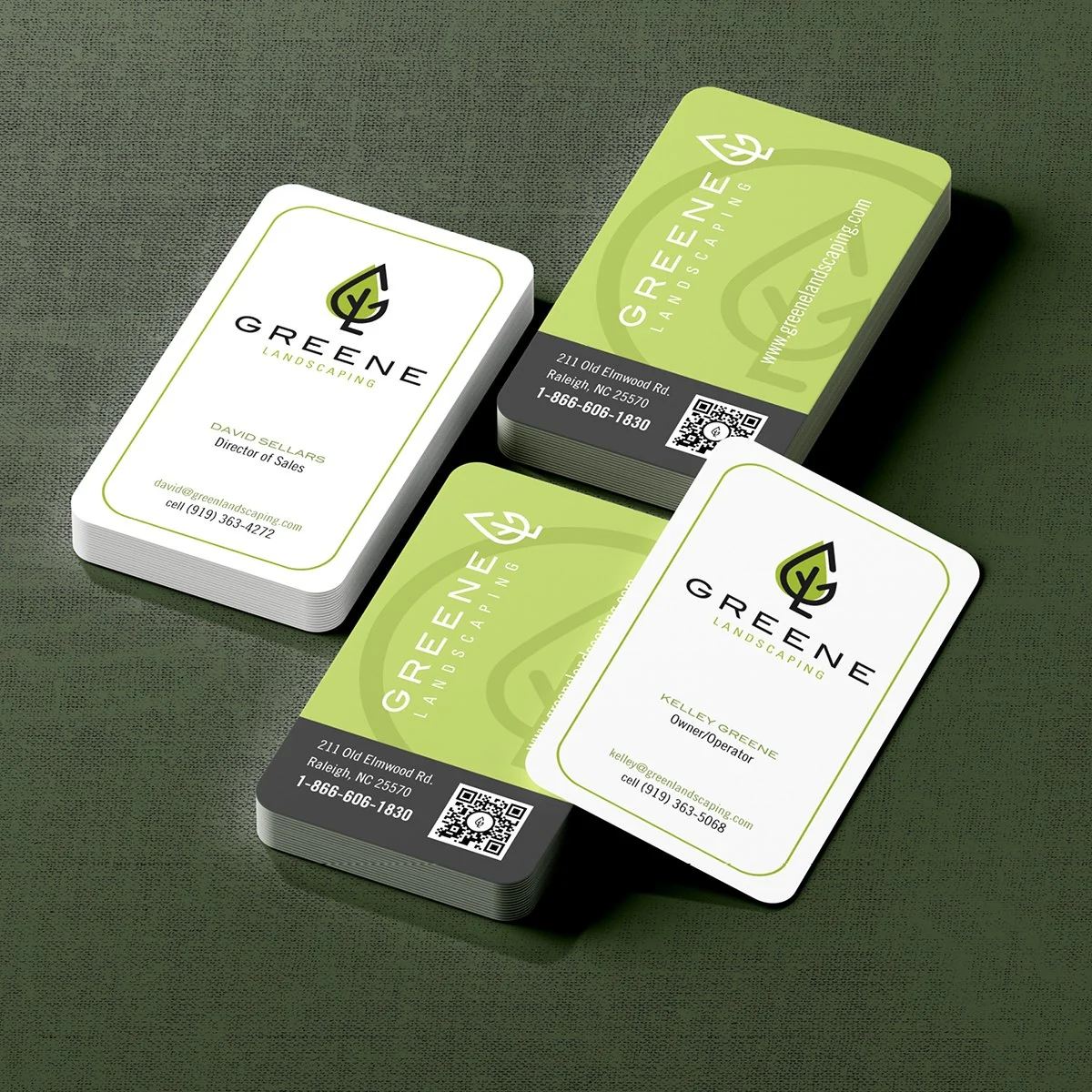
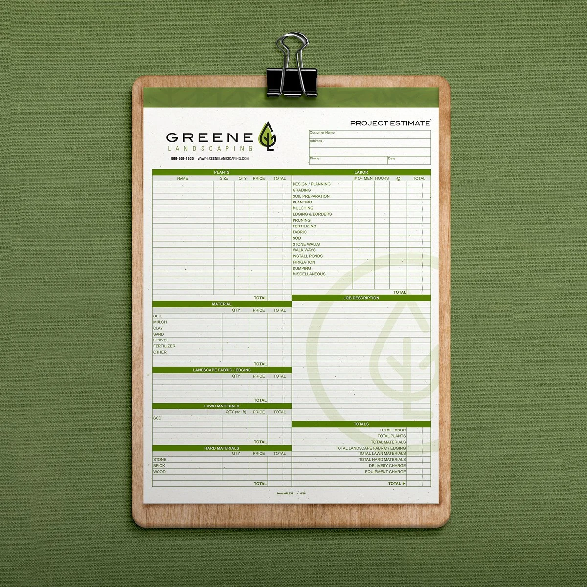
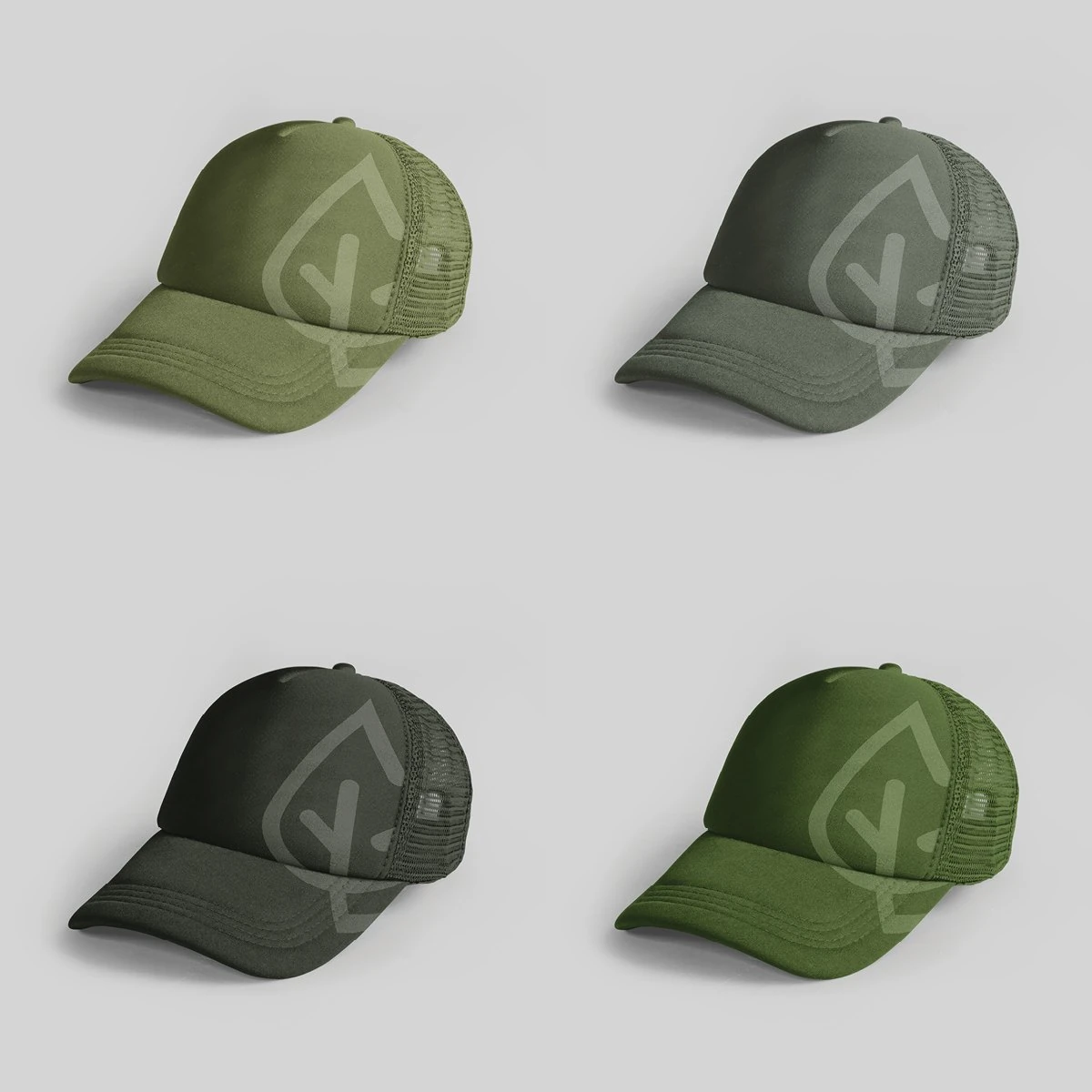
The brand rides along on every job: a wrapped crew truck, rounded business cards, a custom project estimate form and caps in four shades of green.
The campaign
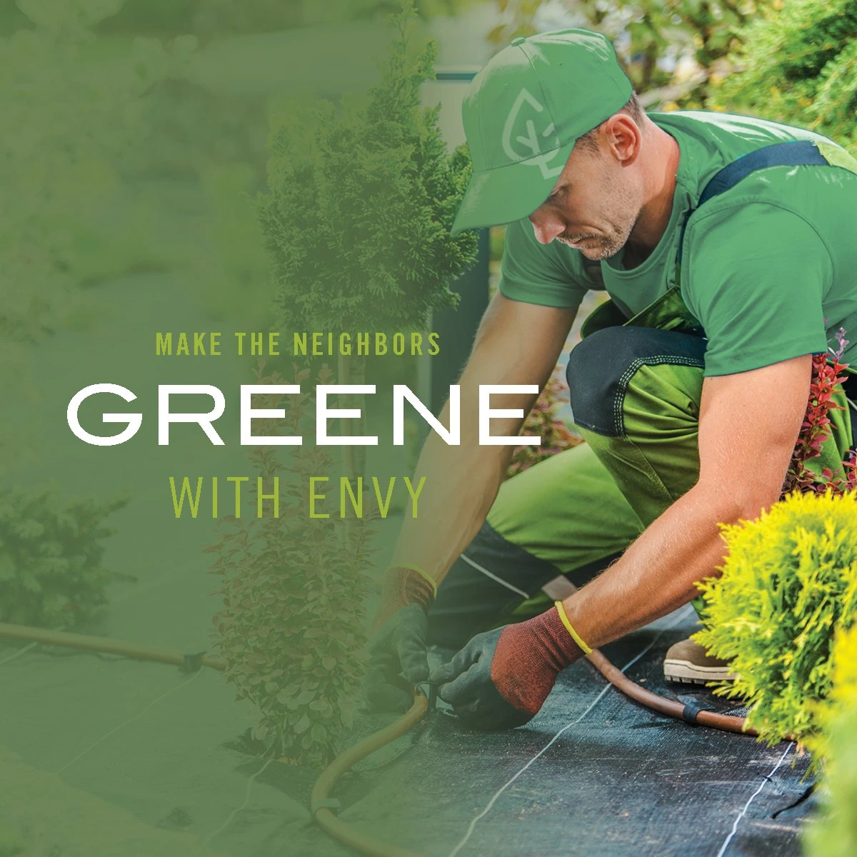
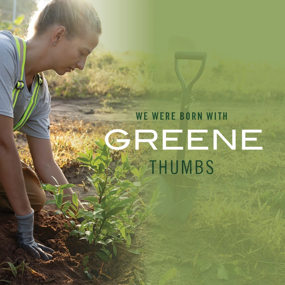
Make the neighbors Greene with envy
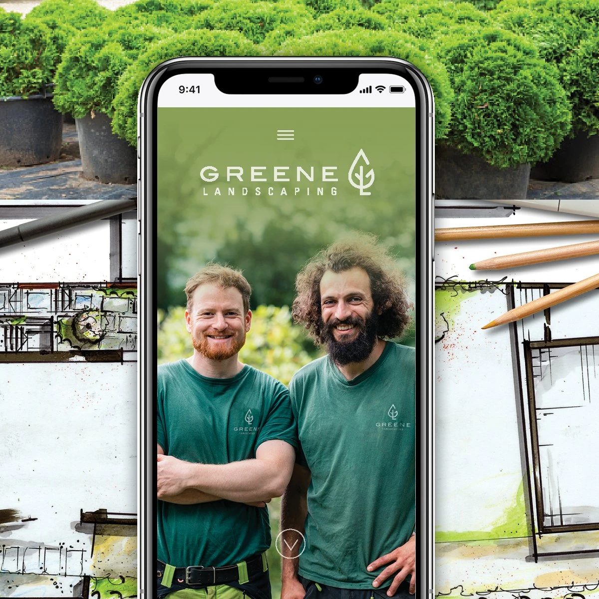
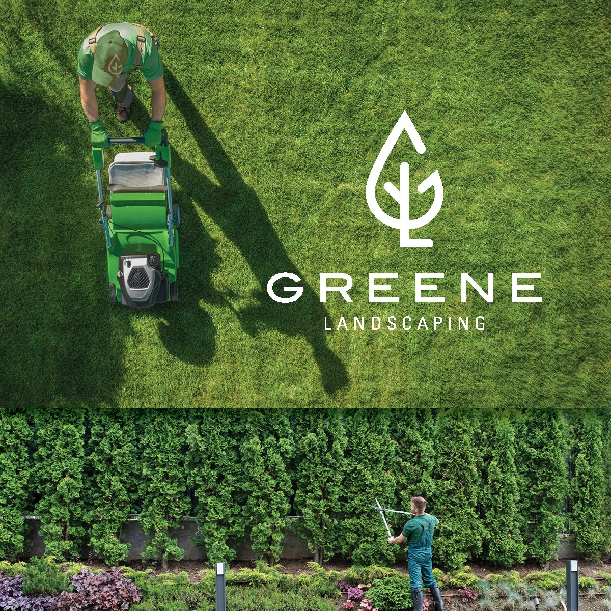
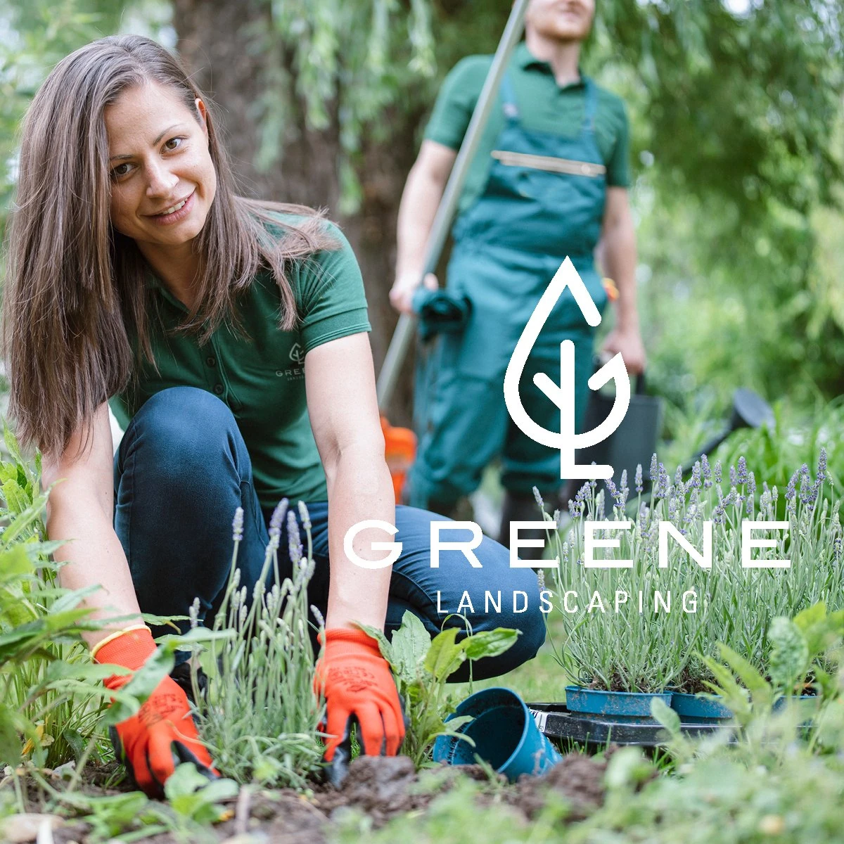
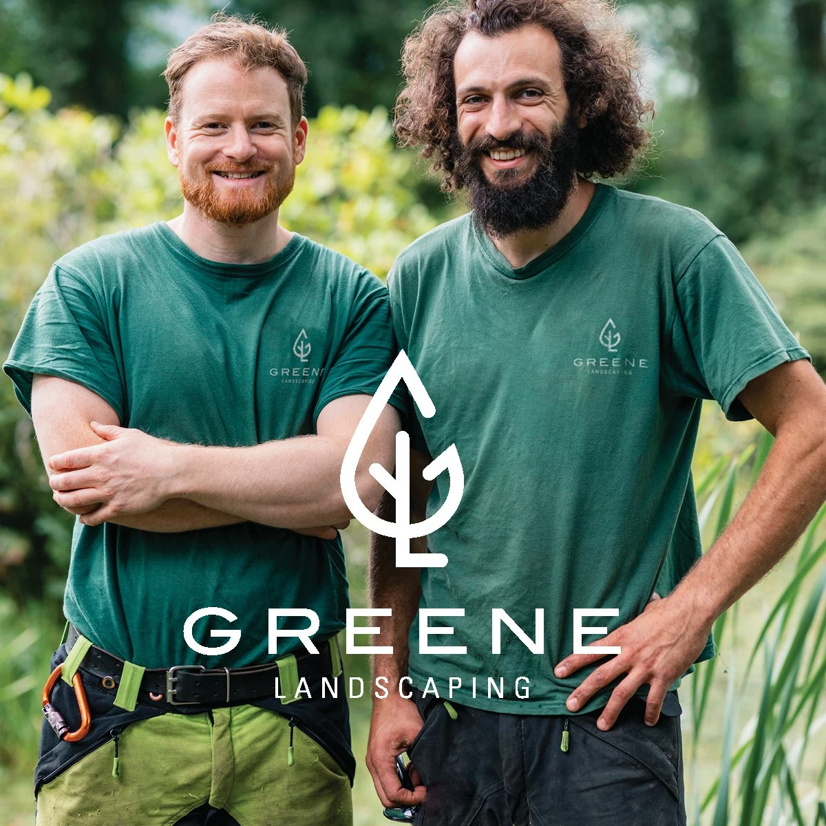
The name was too good not to play with. Real crews and friendly faces carry the lines, so the ads feel like the people who will actually show up at your door.
The website
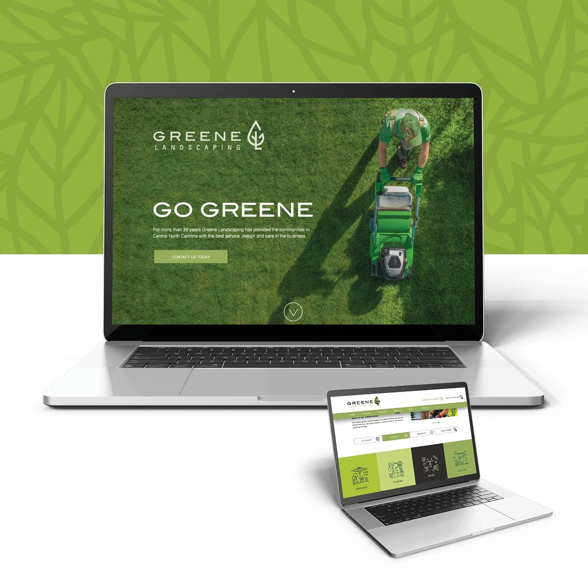
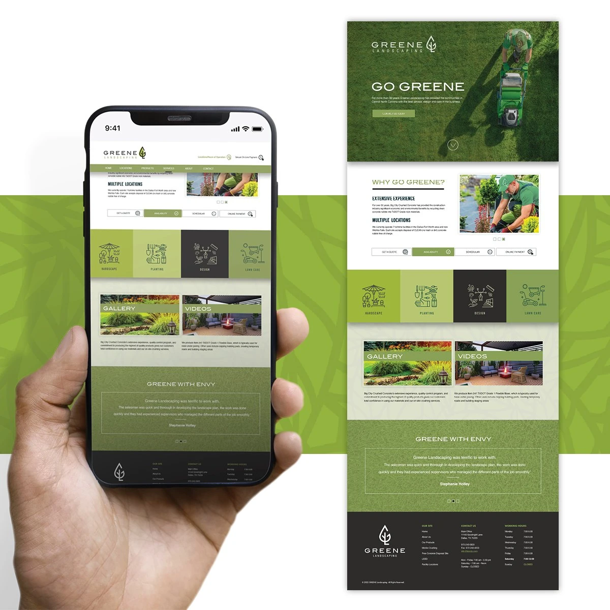
Go Greene online
A bold “Go Greene” homepage leads into services, gallery and quote tools, with the same icons and greens as everything else. It works just as well on a phone in the yard as on a desktop.